Thursday, 18 November 2010
Other Newspapers
I based my newspaper on the layout of my newspaper, I did this by researching many newspapers such as The Times, The Evening Echo and The Daily Mirror, and then seeing what conventions of a newspaper they have, what genre they fit, who there target audience is, and looked at other parts of a newspaper such as how big the images should be and use of colour.


Friday, 12 November 2010
New Masthead!
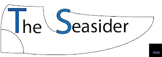
As recommended in the recent post about feedback, I have changed the masthead in order for it to look more professional. Below is the new masthead...
I produced this masthead in photoshop, and using an image of a football boot, and adding several layers, I feel that I have created a good masthead. It follows the conventions of the last masthead in that the colors of blue are still there, as they are linked to the colors that Southend United Football Club wear. The green also links with the football theme of the masthead as it represents the pitch.
I produced this masthead in photoshop, and using an image of a football boot, and adding several layers, I feel that I have created a good masthead. It follows the conventions of the last masthead in that the colors of blue are still there, as they are linked to the colors that Southend United Football Club wear. The green also links with the football theme of the masthead as it represents the pitch.
Thursday, 4 November 2010
6 Weeks into the project
Subscribe to:
Comments (Atom)


